Matplotlib hatch is a pattern that can be used as an overlay in bar charts, shapes and are important to ensure the readability of graphs in the absence of color (when printed in a single color format). Unfortunately, there are only a few patterns available on Matplotlib.
By reading this post, you will be able to create a custom square hatch pattern that can be used in any of your Matplotlib graphs. You can extend this to create whichever shapes you fancy.
1. Create Matplotlib Hatch Pattern
Shapes provide the base class used to create different Matplotlib patterns. We will extend the class to add a square shape. We will create a Rectangle shape with starting at (-0.25, 0.25) and with the height and width equal to 0.5. By using hatch.count we can increase the density by repeating the usage.
from matplotlib.hatch import Shapes
from matplotlib.patches import Rectangle


class SquareHatch(Shapes):
    """
    Square hatch defined by a path drawn inside [-0.5, 0.5] square.
    Identifier 's'.
    """
    def __init__(self, hatch, density):
        self.filled = False
        self.size = 1
        self.path = Rectangle((-0.25, 0.25), 0.5, 0.5).get_path()
        self.num_rows = (hatch.count('s')) * density
        self.shape_vertices = self.path.vertices
        self.shape_codes = self.path.codes
        Shapes.__init__(self, hatch, density)
2. Add Custom Class to Hatch Types
You will need to import _hatch_types in order to append to the list ensuring that we can access our bar patterns within any plot method supported my Matplotlib.
from matplotlib.hatch import _hatch_types
# attach our new hatch
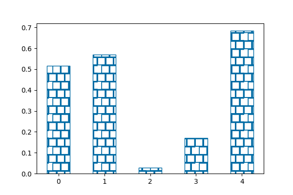
_hatch_types.append(SquareHatch)3. Create a Minimal Example
import matplotlib.pyplot as plt
import numpy as np


def main():
    # attach our new hatch
    _hatch_types.append(SquareHatch)
    # plot random bars
    np.random.seed(101)
    num = 5
    y_values = np.random.rand(num)
    x_values = np.arange(num)
    fig = plt.figure(figsize=(6, 4))
    ax = fig.add_subplot(111)
    color_blue = np.asarray([0, 107, 164]) / 255
    width = 0.5
    ax.bar(x_values, y_values,
           color='w', edgecolor=color_blue, hatch='s', width=width)
    plt.show()


if __name__ == '__main__':
    main()
With this you will get the following graph.
4. Use Density with Grouped Bars
If you ever find that you need to plot grouped bar charts, you can repeat the hatch to increase the hatch density as follows.
import matplotlib.pyplot as plt
import numpy as np


def main():
    # attach our new hatch
    _hatch_types.append(SquareHatch)

    # plot random bars
    np.random.seed(101)
    num = 10
    y_values = np.random.rand(num)
    x_values = np.arange(num)
    fig = plt.figure(figsize=(6, 4))
    ax = fig.add_subplot(111)
    color_blue = np.asarray([0, 107, 164]) / 255
    width = 0.5

    # group bars
    ax.bar(x_values[::2] - width / 2, y_values[::2], color='w', edgecolor=color_blue, hatch='s', width=width)
    ax.bar(x_values[::2] + width / 2, y_values[1::2], color='w', edgecolor=color_blue, hatch='ss', width=width)

    # # set labels and ticks
    ax.set_title("Example Bar Chart")
    ax.set_xlabel("x")
    ax.set_ylabel("y")
    plt.show()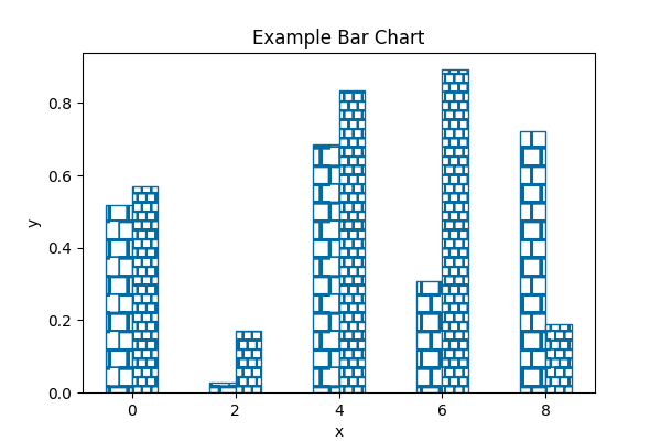
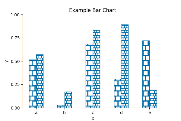
5. Reduce Data – Ink Ratio in Matplotlib Hatch Pattern
As any visualization, it’s important to remove unnecessary ink in your plot. Matplotlib is notorious to add unwanted lines, boxes and spines. Therefore, you might want to consider adding the following snippet will clean up your graph.
# clear spines and set color
ax.spines['right'].set_visible(False)
ax.spines['top'].set_visible(False)
ax.spines['left'].set_bounds(y_ticks[0], y_ticks[-1])
ax.spines['bottom'].set_bounds(x_values[0], x_values[-2])
ax.spines['left'].set_color('darkorange')
ax.spines['bottom'].set_color('darkorange')
Here’s the full example.
import matplotlib.pyplot as plt
import numpy as np
from matplotlib.hatch import Shapes, _hatch_types
from matplotlib.patches import Rectangle


class SquareHatch(Shapes):
    """
    Square hatch defined by a path drawn inside [-0.5, 0.5] square.
    Identifier 's'.
    """
    def __init__(self, hatch, density):
        self.filled = False
        self.size = 1
        self.path = Rectangle((-0.25, 0.25), 0.5, 0.5).get_path()
        self.num_rows = (hatch.count('s')) * density
        self.shape_vertices = self.path.vertices
        self.shape_codes = self.path.codes
        Shapes.__init__(self, hatch, density)


def main():
    # attach our new hatch
    _hatch_types.append(SquareHatch)

    # plot random bars
    np.random.seed(101)
    num = 10
    y_values = np.random.rand(num)
    x_values = np.arange(num)
    fig = plt.figure(figsize=(6, 4))
    ax = fig.add_subplot(111)
    color_blue = np.asarray([0, 107, 164]) / 255
    width = 0.5

    # group bars
    ax.bar(x_values[::2] - width / 2, y_values[::2],
           color='w', edgecolor=color_blue, hatch='s', width=width)
    ax.bar(x_values[::2] + width / 2, y_values[1::2],
           color='w', edgecolor=color_blue, hatch='ss', width=width)

    # # set labels and ticks
    ax.set_title("Example Bar Chart")
    ax.set_xlabel("x")
    ax.set_ylabel("y")
    y_ticks = np.linspace(0, np.round(max(y_values), 0), 5)
    ax.set_yticks(y_ticks)
    ax.set_xticks(x_values[::2])
    ax.set_xticklabels(['a', 'b', 'c', 'd', 'e'])

    # clear spines and set color
    ax.spines['right'].set_visible(False)
    ax.spines['top'].set_visible(False)
    ax.spines['left'].set_bounds(y_ticks[0], y_ticks[-1])
    ax.spines['bottom'].set_bounds(x_values[0], x_values[-2])
    ax.spines['left'].set_color('darkorange')
    ax.spines['bottom'].set_color('darkorange')

    plt.savefig('hatch-graph-example-minimal-2.png')
    plt.show()


if __name__ == '__main__':
    main()
That’s it. Don’t forget to like / subscribe if you enjoyed the post.[wpdiscuz-feedback id=”rjqipqpjq9″ question=”Please leave a feedback on this” opened=”0″][/wpdiscuz-feedback]